 |
|
||||||||||||
|
|
|||||||||||||
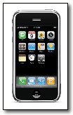 |
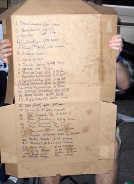 Highlight: iPhone Heuristic EvaluationQuick Overview: When iPhone launched, all manner of Sprint project and program groups wanted to know if the iPhone would live up to its user experience expectations. Two of the many evaluations I conducted included a Usability SWOT for executive teams and extensive evaluation covering over 400 tasks.Point of Interest: Purchasing the first iPhone was an experience all by itself. No other phone has produced first day of sale, huge overnight lines. The pizza box pictured here represents the order of the first 50 people in line at the Kansas City store. I'm number 27 on the list. |
||||||||||||
|
|
|||||||||||||
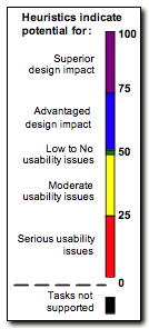 |
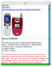 Highlight: Measure User Experience by Developing a Method of Heuristic EvaluationQuick Overview: Evaluating the usability of all pages and experiences of a is simply impractical. I developed a method of evaluating a handset that focuses on task evaluation, where higher overall scores identify a handset with advantaged usability, while lower overall scores identify a handset with extensive usability issues.Point of Interest: Any heuristic evaluation is only as good as the evaluator, their domain knowledge, and skill in predicting behavior. In light of this, the goal was to create a method that brought out the usability issues and highlighted design advantages that could then be discussed. This resulted in much more discussion, and less time being bogged down in score validity. |
||||||||||||
|
|
|||||||||||||
 |
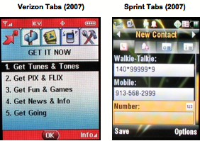 Highlight: Leading User Experience by Defining and Executing a Competitive Usability ProgramQuick Overview: In 2007, I was tasked with starting a Competitive Handset User Experience program. For the next two years, working as the sole source, I defined much of the operational and strategic direction, and expanded its influence into over twenty functional groups, including C level executives and Legal. Merging my research and design background with skills from the Competitive Intelligence community, I provided not only user experience competitive comparisons, but also advance notice of upcoming user experiences and potential competitive design strategies.Point of Interest: Integrating the Competitive User Experience program into design and decision processes was self generating. Organizing research priorities was often a weekly, if not a daily, requirement. The next steps in developing the program were 1) to target the project areas where competitive user experiences was needed the most, and 2) to expand the resources to support the workload. |
More... Leading UX Design and Research
|
|||||||||||
|
|
|||||||||||||
 |
Highlight: Extensive Usability Testing for 2003 SprintPCS.com Site LaunchQuick Overview: In preparation for the Sprint's first 3G launch, multiple changes were occurring in all user interfaces. I participated in the usability research and design of both the SprintPCS.com web site and the handset UI. The SprintPCS.com user experience team and two other teams participated in a competition for best design of the new web site. My role was to measure the usability and provide redesign recommendations. By strategically measuring site aesthetics, I provided an additional advantage to our team. We won the competition on both task success rates and aesthetics.Point of Interest: Measuring the aesthetics of the site had to be both practical and expedient. The first step was to understand what users actually expected from our site. For example, as shown by the figure below, user may have expected the optimum pale/faded to colorful rating to be a 5, rather than a 7. If the data below represented findings from the study, then the new site would need improvement in the area of pale/colorful. By combining this type of information with the usability issues and user comments, I was able to provide recommendations for redesign that had a winning impact.  |
||||||||||||