|
|

|
Highlight: Measuring User Experience through a Method of Heuristic Evaluation
Overview

While it is important to understand the usability of the competitors' products and services, it is not always expedient or cost effective to put every one of them into a usability study. Using heuristics is one way of getting close to understanding the usability impact upon the user.
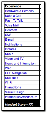
The first objective for the program was to create a way of getting at the overall usability of a competitive handset, both through a method of evaluating the user interface, and through a score that would benchmark the device against other handsets. The key would be to understand the context in which to conduct the evaluation. Should it be through a list of defined heuristics (e.g., Norman/Nielsen lists), through general design UI principles (e.g.,mental models, memory systems, physiological factors), or some other. In this case, to work towards identifying usability issues and user experience impacts, I chose tasks and UI design constructs (e.g., navigation, interaction). Through this method, I identified tasks that would assist in evaluating a variety of handsets across many different core functionalities.
Research Design

The research project was accomplished through a series of stages, each lead by a core question:
- What to evaluate? Should the details of a UI page, such as "a color was red when it should not be," play a role? Should it be based on a specific set of heuristic rules against which each page view is rated? In the end, efficiency won the day, and a task-centric approach was used. In this way, we can evaluate those things associated with a task and rate the overall design of the tasks.
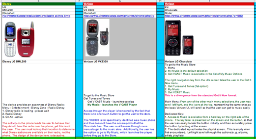
- Which tasks to evaluate? The first handset evaluations were performed using more than 400 tasks. This helped to generate a database of UI design issues and understand the impact of each task on the overall UI experience. The set was then paired down to just over 50 tasks and user interface constructs (e.g. Navigation, Information Architecture, and Hardware).
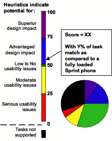
- How to evaluate each task? A heuristic evaluation is best done with multiple raters. So what happens when you will be the only rater? The answer for this project was to provide a method of weighting the overall severity of the usability issues and the advantaged impact of superior designs. For this, the scale dimensions had to represent practical, face valid descriptions of the design. The avenue taken was to define the lower end of the scale as showing devices that were characterized more by their usability problems, while the upper end of the scale would represent handsets that were superior in their user experience designs.
Accomplishments

- The method supported a practical approach for evaluating the handset that gave insight into a variety of handset experiences.
- When used against tasks that were performed in usability testing, I was able to predict approximately 80% of the primary usability issues, and many of the secondary issues as well.
- The method could be used on the handset as a whole, or just in parts. For example, a parental controls experience on one handset could be compared to a competitor's parental controls experiences. In this way, functional differences and experiential differences could be highlighted for a project manager, who could use the information to define the next set project upgrades.
- Trending and individual details could be used in discussions with designers and others. In this way, data on older handsets could continue have an influence on redesigns and future functionality.
- The method and its results greatly increased the visibility of the competitive program to both internal and external teams.
Building on That

- Lesson Learned: It is very possible to transfer this same methodology to a domain other than handsets. While it is important to evaluate a large number of tasks on the product or service, more expedient results can be obtained by first starting with a set of tasks believed to be representative of the handset, and report findings on those first, while continuing to collect data about the entire handset. This would have lead to greater use of the tool in earlier stages of its development
- Further validation of the technique would help refine the method. It is important to remember that a heuristic evaluation performed by one individual is not a consensus, but is rather a guide towards discussion. If given the chance to implement this method in a new domain, I would seek to pursue that course.
Skills

- Task and cognitive task analysis
- Scale design
- Synthesis of data and mathematical formula to generate a score
- Driving towards face validity and practicality over rigor in the face of designing a tool used primarily for facilitating ideas and discussion
- Persistence in the details of evaluating over 400 tasks per handset
- Microsoft Excel
Back to Portfolio Highlights
|
More...
UX Measurement Activities
|

