|
|
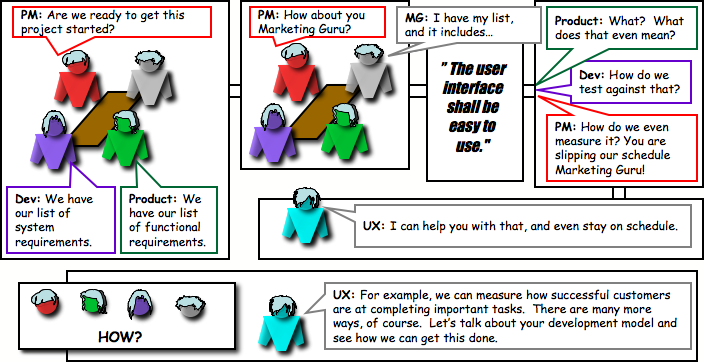
Easy to use: The "Dreaded" Requirement


 --- Requirements --- --- Requirements --- ------------- Design ------------- ------------- Design ------------- --------- Implementation ---------- --------- Implementation ----------
|

Identify User Requirements
- What key user experience principles do users need in the product? For example, do users require the abilities to compare, control, have fun, stay aware, make decisions, get tasks accomplished? Each of these can be converted into measurable statements. Some may be objective, such as "The user shall be able to decide if they want feature set A or feature set B, because they are different types of users." Some may be more subjective in nature, such as "The user shall be able to have fun while waiting in line in order to pass the time more enjoyably.
- At this stage, some of the requirements may not yet be measurably defined, while other's are. Not to worry, greater detail in how to measure these progresses with each stage. At times, benchmark standards may be in place already. For example, a company may have a policy that no product is launched unless 90% of the user base is expected to complete the top 10 tasks in 3 minutes or less and 60% are expected to give it a "meets expectations" rating.
|

Early paper prototype testing
- Designers will use the early sets of requirements and what they know about the user, system, and primary tasks to design general interactions models. These models can be used for validating company expectations for the product. They can also be put in front of users, such as focus groups or advisory panels, to gain insight into how well the models are meeting the requirements, and what may be missing.
- Concept models are typically not targets for specific measures, but more general measures may be taken. For example, a focus group member may be asked to generally state whether the product seems to be meeting, exceeding, or not meeting expectations. Later, this measure will become more precise, and even measured for statistical significance, if appropriate.
|

Mid phase multi-prototype testing
- Once the designer is confident in the model, the next step is to design specific prototypes out of it. If time, more than one should be made. Why? Because they can be put in front of users and measured for which one, or which parts of both, are getting the job done.
- At this stage, measures of success are defined before the user studies to determine what is working and what is not, or the results of the user studies help define the measures used in the next round of design iteration. For example, after several users have performed the task, it may be found that it takes 5 minutes to perform a task, and that is only slightly above what the user's expected. A measurable benchmark, say 4 1/2 minutes, may then be set based upon the user expectations.
|

Pre-launch iterative usability testing
- As design moves towards more concrete software iterations, it's time to get more detailed measurements. A number of different methods can be employed to obtain data that will measure the "ease of use" of the system. The SUS, or System Usability Score, can be used to measure the product against users' expectations. Task can be measured by completion rates, error rates, efficiency rates, and also by subjective measures. User experience professionals will look for problem users have, how critical they are, and how frequently they occur. Problems can be discussed with the designer and others in order to rectify the problems and redesign for greater success.
|
The Skills of a Usability Tester

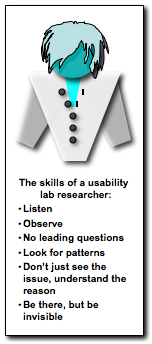
I don't intend to provide an exhaustive list. I have included ones I find of particular importance:
|

|
- Listen: When I'm really listening, I set aside what I know. What I hear and see I must reconcile with the interface, and not what I know about the system. Listening tunes into what the user sees, thinks, prefers, understands, contemplates, expects, questions, and decides. Listening hears the difference between the participant's "I think" and "I know." Listening hears the halt in a voice when a participant starts to say something, and then stops. Listening gives me the understanding of their experience. It's only after that
There was this time… when I was conducting a usability study on Picture Mail. Participants would take pictures with their phones and then upload the pictures to their web account. By listening to what they said about the upload process, I was able to understand that they had no idea where the pictures were going, nor that they could get them back to their phone. Had I only paid attention to their behavior, many of them would have completed the task successfully. It was because they expressed, in many ways, that they had no idea where their pictures had gone, that counted the task as failed.
- Observe: Behavior is the visible outcome of a participant's decisions. When their behavior and comments go separate directions, there is much to be learned.
There was this time… that I was evaluating something called the iPhone. Maybe you've heard of it. I was attending to how a number of people were working with the Contacts section. I noted that after having put several pieces of information into a contact, they selected the Home button, and felt confident they had added the contact. Apple has fixed this now but in the initial software version, if you did not select the "Done" button, then it did not save the contact.
- No leading questions: The faster I ask a question, the less like I am to have the natural context for the answer. I have also found that asking a series of questions, starting at an earlier point in the participants task flow, provides a greater context and more clarity than asking about a particular problem.

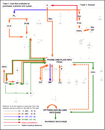
- Look for patterns: Patters develop primarily across participants, but I don't mean to disregard those that happen within a participant that often provide great insight into why an interface is confusing. The great thing is that a lot of software, such as online usability and eye tracking software, is sophisticated enough to accomplish what we humans can't readily accomplish. These methods aren't always available of course. And even when they are, they can't always see what I can see, or are not designed to look for the measures I'm interested in. I find it is worth the effort and time to make my own pattern collection devices when I don't have the sophisticated tools. The figure on the right is one I have used for tracking patterns when I had zero budget.
- Don't just see the issue, understand the reason: This requires matching the behavior to what is happening in the interface, and the participant's decisions. It means understanding what the designer did intentionally in their design. It is surprising, for example, how many times I have seen a user choose a wrong link in a list of links because of confusion between their target and the other link terms.
- Be there, but be invisible: Whether I am behind the glass or in the room, it is critical to get the participant engaged with the product or service as though I was not there. I can do so by managing where I sit, my voice inflection, what I wear, what we say, and when we say it. I try to ensure that the participant's experiences are as undisturbed as possible, including their emotions, which can shed real light on the usability of a product.
There was this time… when I had a participant that cried because of the difficulties she was encountering with the UI. Not out of control, mind you, but clearly crying. Isn't this a fine line to walk. Do I let her cry and continue? Do I impart myself upon the situation, and if so, how much? The strategy I use is to be sure that the emotion has had it's impact upon the team, and that the usability issues are understood. Most important is to acknowledge the participant's emotion, that it is real, and that it is true, and to assure them that they are safe in that emotion. I've had other participants get downright mad at a product. Wasn't that you who wanted to throw your cell phone across the room because of something it did or you couldn't figure out?
|
|
|
