


 |
|
||||||||||||
|
|
|||||||||||||
 |
Usability Testing in the Lab: E-Commerce Site Overview The study was a basic usability study run to understand the user experiences of the e-commerce portion of the web site. The study included tasks such as select a plan, select a phone, and purchase the phone and plan you selected. There are many ways to usability test web sites today, including technology like eye-tracking, which was not available to me at the time I conducted the study. While it is best to have as much data as you can have, understanding the user's interactions with the site through observation and talk-out-loud protocols is still a great way of conducting most in-lab usability studies. And yes, it is also much cheaper for those on a tight budget. Research Design
Accomplishments In the case of this study, an accomplishment that made the difference was finding that the structural design of the web site was causing longer load times. This is not the case as much today as several years ago. In this case, because there is a visual linkage between the plans at the top and the gray area on the right where the user enters their zip code, the participants were being drawn to the right. They would enter their zip code without looking at the content in the center, and would proceed directly to the PCS Free and Clear plans. This limited their options without their knowledge. Ouch. The primary recommendation was to redesign the page based upon a more visually concrete design of the order of steps required. 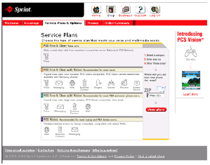
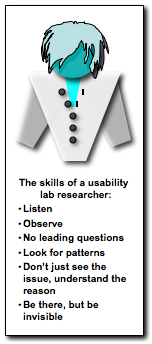
Sorry for the blur. If you read the accomplishments, you'll get the picture. Pun intended. Skills
|
More... Usability Testing
|
|||||||||||
