|
|

|
Usability Testing in the Lab: A series of Tests for the 2003 SprintPCS.com Design
Overview
The SprintPCS.com web site of 2003 had to undergo many necessary changes for the upcoming 3G launch. Changes in platform, functionality, and user tasks required a comprehensive change in all aspects of the web site. The goal was to set up a series of studies that met both the strategic direction of the design, as well as tactical studies that would look more closely at individual pages, and even elements of the design.
The SprintPCS.com user experience activities, inclusive of all design and research, were to be challenged by two other entities, one internal, and the other external, for the final web site design responsibility. The keys to my research efforts were, 1) to ensure usability of the primary tasks associated with the pages that were to be submitted to the web site bake-off, and 2) to ensure that users' experiences at the web site at least met, if not exceeded those of the new web site, particularly in the area of aesthetics.
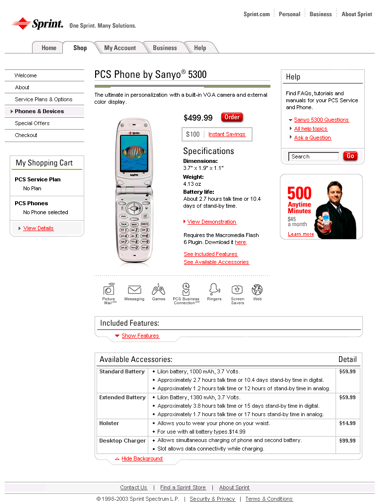
The SprintPCS.com team won the competition. Below is one of the prototypes tested during our research. A piece of a second is shown on the left.

Research Design

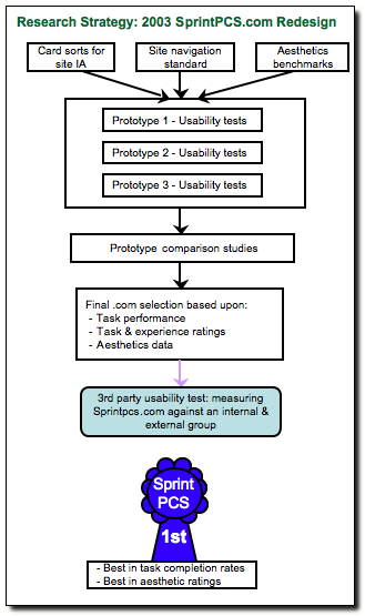
- The overall research strategy was to conduct a series of usability test on prototypes of three different layouts. In this way, the team would understand what aspects of each design was working, and whether a prototype design could stand on its own as the best, or if a combination design would be required.
- As prototypes were completed, usability tests would be run on each to determine how to better optimize the designs.

- We were also informed that bake-off study participants would rate their aesthetic experiences. While the aesthetics list was provided, there was no means of understanding how the users would rate one web site as being a better aesthetic experience than another. To this end, I conducted a series of benchmarking studies in order to establish how to understand a user's expectations for aesthetics, and then collected aesthetic data on each of the prototypes. This allowed additional feedback for the graphics designers.
- The final design would be a standard for many other Sprint (not PCS) web sites that would follow the design set by SprintPCS.com. I designed a web-based study to understand what left navigation design to use. See more about this at my Navigation Standards page.
- Additional research, performed by another member of the team, was conducted on overall web site architecture.
Accomplishments

- Clearly the biggest accomplishment was being part of the team that designed the best of the three competition web sites as usability tested by a 3rd party vendor.
- Finding a way to measure the aesthetics that was both face valid and practicle. While more extensive research could have been done to ensure we were on the right track, there wasn't time. In the end, the competition participants validated that we were at least on the right track.
Building on That

When you are resource constrained (two researchers for the entire redesign project), it's difficult to speculate what more you can have accomplished during that time. As it was, we were parallel testing and keeping the design teams informed as soon as results were available, not even waiting to write reports. That said, a few thoughts on how to build on this type of testing include:
- Obtain a greater sample for the aesthetics benchmarking. During the benchmarking activities I looked at a number of domains other than telecommunications web sites and found that there are differences in what types of aesthetics users expect to see. This would be a great thesis topic of course for an user experience master's degree.
- We had to take a "as the designs became available" approach. Using additional research, such as a longitudinal user panel, we could have provided more feedback throughout our design and research cycles. This may have helped us to limit our prototypes to two instead of three, and increase our redesign/retesting iterations.
Skills

- Experimental Design
- Lab usability testing for prototypes (plan, design materials, identify tasks, facilitate study, statistics, report)
- Screener development and working with external recruiting vendors
- Synthesizing findings into actionable design recommendations
- Designing new user experience measurements
- Ability to work in tight timelines and deliver results
Back to Portfolio Highlights
|
|


