|
|
|
Measuring User Experience: Does Navigation Typography Make a Difference?
Overview
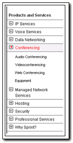
There are two common, and at least one growing in popularity, means of site navigation. Good design methods include top and left navigation methods. Right side navigation is also on the rise. Which type of navigation should be used, and does the typography make a difference? Certainly, there are ways of designing all three options such that there is clear feedback to the user as needed. However, companies may impose certain types of restrictions, brand color for example, that may affects usability. This was our case. The goal of the project was to look at different navigation systems, submitted by several individuals and groups, to determine an optimum design for the Sprint.com web site.
Research Design

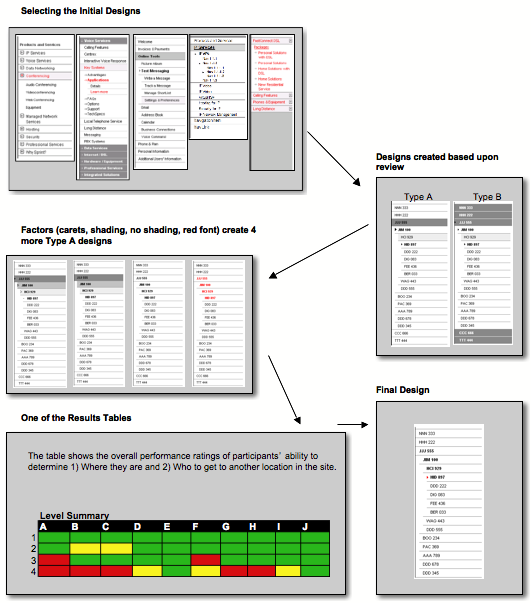
The research proceeded as a multi-phase project. The graphic below demonstrates the phases. Some of the phases included:
- Individuals and groups were allowed to submit their designs to a Standards Review Board. A level of heuristic review about the general feasibility of the menu system was conducted. A set of five finalist was selected.
- Variables were selected for the study. Upon looking at the designs submitted, some of the variables included:
- Selected item v. Non-selected item is shaded/not shaded
- Identifiers, such as a caret, is included or not included
- Color, such as red, is included or not included
- Two primary designs, target shaded v. boundary shaded, were created based upon the submissions. The first set, or Type A, highlighted only the target object. Type B highlighted the boundary items.
- From each type, and using other factors such as shading, carets, and red font, we designed two sets of five navigation systems. Not all combinations were utilized. Some were deselected based upon heuristic design principles. Each site was built down to four levels of navigation based upon the new Sprint.com expected content.
- A tool was then developed to display each of the navigation systems, and to prompt the user to perform two primary tasks:
- Determine where you are in the hierarchy.
- Go to another location within the hierarchy.
- An experimental study was run to understand both the participants' performance on each of the 10 navigation systems, but also the ranked preference.
- After reviewing the results, a slight modification of the design was tested against the performance of the previous 10, and was provided as the final recommendation to the Standards Committee.
Accomplishments
The final recommendation was accepted by the Standards Committee and was adopted as the standard for both SprintPCS.com and Sprint.com sites. From a team perspective, the accomplishment was putting together the research design and the tools needed to measure the performance. It was necessary within the project do define the specifications for the measurement tool, which required design skills and the assistance of a really great web developer. Teamwork, at the end of the day, is what most often what makes anything an accomplishment.
Building on That
The study did include another variable, content, that extended the understanding of the navigation system performance.
- Expected SprintPCS.com content was used for one part of the study, and content from a well known outdoors lifestyle site used as a comparison.
- Brand names were not included in the study, though static content was provided in the body of the site.
- The font color, red, was not part of the branding of the outdoor lifestyle site, but was kept constant for purposes of the study. It is noted here that both contents resulted in the same performance findings.
Skills
- Experimental Design
- Understanding what to measure
- Designing and specifying a system to collect the right measures
- Team collaboration
- Usability testing
- Data synthesis and creating actionable design recommendations
Back to Portfolio Highlights
|
More...
UX Measurement Activities
|