


 |
|
||||||||||||
|
|
|||||||||||||
 |
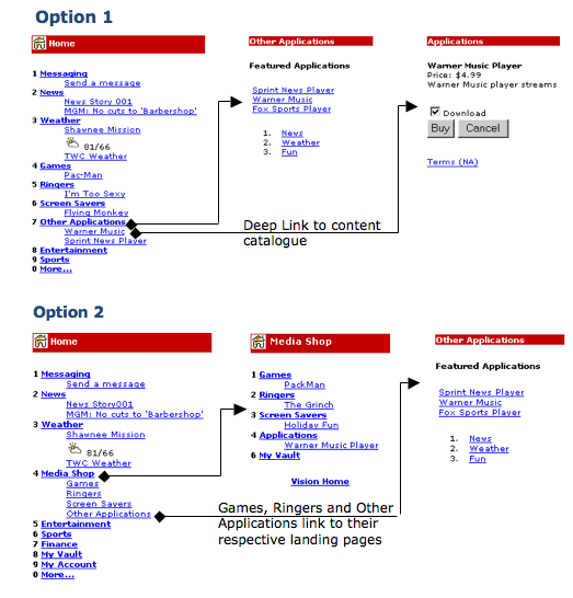
Usability Testing in the Lab: Information Architecture of the Wireless Web Overview During the launch of the 3G wireless web, a number of usability tests were conducted on information architecture flows, top level categorizations, and task paths such as how to purchase a ringer or music. The structures were not only looked at from the perspective of the wireless web, but also for their impact upon the new wired web site, also under new construction. Many of the underlying structures first investigated during these types of studies have created the foundation for standard tree hierarchy flows that still exist today. Research Design The study was conducted as a standard usability test, with prototypes 1 and 2 split in a between subjects design. We had a total of 16 participants, including both tech savvy and novice users. Tasks were kept the same for both groups. Measures included success rates, task path deviations, terminology difficulties, back tracking behaviors, and other usability issues. A few key questions being investigated during the study included:
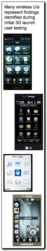
 Accomplishments At that time, one of the major findings of the research was that top level labels on their own often do not do enough to assist the user in understanding the location of an item. However, if you look at today's wireless UI's (excluding designs such as the iPhone and those with Android UI's -I'll come right back to them), many still have the same general categorizations as they did back in the day of this research (see figure upper-left). While we can certainly say that this has happened because the content metaphors are generally stable (i.e., messaging, settings), they have certainly been learned. User interfaces such as iPhone and Android, and other Windows, Palm, etc. UI's, have certainly branched out of this design, favoring to bring the user closer to the tasks or applications they wish to run, rather than force them through hierarchies for everything. This design is essentially what we learned back in the day of 3G launch, but did not have the processing power or hardware to support. Skills
|
More... Usability Testing
|
|||||||||||
