|
|

|
Leading the Design of an Online Shopper's Guider
Overview
The last time you thought about changing wireless phone plans or getting a new wireless phone may have been at least somewhat mentally complex. For some, trying to wade through all of the combinations and permutations of which wireless phone to get with which wireless plan is a bit more than they can stomach. The plan was to create a Shopper's Guide that would accomplish the following:
- Take into consideration the target market segment type at that time
- Provide a recommendation for what phone and plan might serve the customer well.
- Increase the number of wireless phone purchases on the web
Research and Design

I conducted the research and design phases in this way:
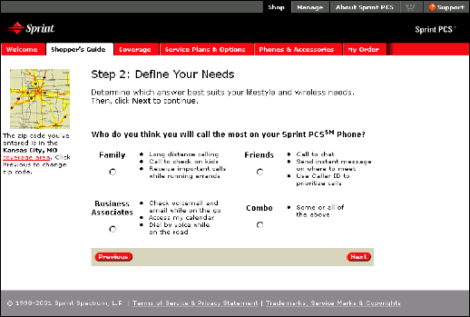
- Understand how the market segment speaks about their needs. A directive of the project was to use a successful set of sales team questions commonly used to understand the customer's needs. My goal was to understand how to provide a series of answers the user could select from that would clearly identify their target segment. I employed focus groups and their communications to identify key words and phrases to use in the design. A key contributor to this part of the project were the two Content Designers. Our mission was to keep the questions as close to what was given to us, and to term the answers in short, yet clearly identifiable market segment answers.
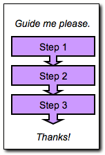
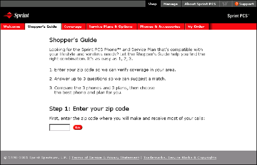
- Work with the web developer to understand the layout of the web pages that we had to work with. From this, a three step approach (see pages below) was conceived that would keep the user focused. In this case, providing all of the question and answers in one location was not helpful to the user as changing answers to questions "just to see the affect" would ultimately provide the same sense of complexity as the regular shopping process.
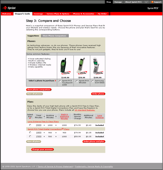
- Design the layouts of the the question set, recommendations page, and shopping cart. The core principle I added to the recommendations page was to ensure that the customer had a clearly identified single recommendation, and to have a "lesser" and "greater" option to choose from. This design construct allows the user to understand the significance of the answers they provided, and to give them the flexibility of control.
- A set of initial mockups was user tested with participants that represented potential customers. Results were used to modify the design, and test again.


Accomplishments

The Guide succeeded in closing more purchases than required by the business case, and increased the overall number of wireless phone purchases month over month.
Building on That

Working as the designer and the usability tester is very rewarding, if you are willing to lay your design down and listen to the customer data when it suggests something isn't working. As it turned out, running studies on my work identified my this strength to the team. I was transitioned to the researcher role for the group, and put together a lab program.
Skills

- Design process
- Focus group guide development and facilitation
- Usability testing
- Data analysis of qualitative and quantitative data
- Key user experience design issues relevant to the project
- Writing specifications
Back to Portfolio Highlights
|
More...
Leading UX Research and Design
|

